|
|
This article was originally published in the Fall 2008 issue of The International Journal of Comic Art, and a portion of it later appeared as How Sin CityReconciled Frank Miller and Hollywood. Copyright Luke Arnott 2008; Images Copyright Dark Horse Comics.
BLAM! The Literal Architecture of Sin Cityby Luke Arnott
Sin City, written and illustrated by Frank Miller, has long been renowned for its striking, nihilistic style. The series’ interplay between experimental black-and-white artwork and the storytelling conventions of crime comics and noir cinema make the universe of Miller’s fictional Basin City, with its motley collection of lowlifes, assassins, and crooked politicos, fruitful for study. Yet just as there is no “real” Basin City, the object here is not its “real” architecture—the construction of its tenements and townhouses. Instead, the “literal architecture” I intend to examine is the graphic construction and arrangement of letterforms in Sin City, specifically the onomatopoeic word Blam which conveys, visually, the sound of a gunshot. Through this ubiquitous example, I will both outline how Miller’s graphic technique in Sin City challenges the interplay between words and pictures so fundamental to sequential art, and also explore the implications of that approach. Miller, while possessing a keen instinct for visualizing letters, ultimately demonstrates scant interest in those very implications; nor is he alone, among even the best comic book creators, in overlooking the complex relationship between letterforms, words, and sound in comics. Just as vital as evidence from Miller’s own work, then, to examining this relationship in Sin City is the theoretical underpinning of comics in general. Since the emergence of the modern comic strip around the turn of the 20th century,[i] literary critics and intellectuals had been taking note of the fledgling medium. For instance, in 1926 Thomas Mann wrote a perceptive and eloquent introduction to Belgian artist Frans Masereel’s Passionate Journey: A Novel Told in 165 Woodcuts (13-21); in the 1960s, Umberto Eco (146-64) examined the tension between the novelistic and mythopoeic strains in—and Marshall McLuhan (105) the totalitarian implications of—the weekly Superman comic strip. Even so, these writings never dealt with the medium of comics on its own terms, focusing instead either on its pictorial or its narrative aspects, but never on both together—though that totality is what makes the medium so unique. As comics had, for the most part, remained unsophisticated through the mid-20th century, this under-appreciation is understandable. The unfortunate corollary, however, was that the perceived childishness of particular comics translated into wide derision for the comics medium as a whole. Thus Dorothy Parker could credibly, if acerbically, write in 1943: “For a bulky segment of a century, I have been an avid follower of comic strips—all comic strips; this is a statement made with approximately the same amount of pride with which one would say, ‘I’ve been shooting cocaine into my arm for the past twenty-five years.’ ” (35) Critical attitudes began to change only in the 1970s and 1980s, with the rise in the artistic and technical sophistication of comic books. In 1978, Will Eisner, author of the influential and innovative 1940s newspaper strip The Spirit, ended a long hiatus from comics to write and illustrate A Contract With God, a pioneering “graphic novel,” or book-length comic. It was fitting, therefore, that in 1985 Eisner would break new ground of a different sort, publishing Comics and Sequential Art, the first work written by a master practitioner to deal seriously with the comic book medium in structural and theoretical terms. While Comics and Sequential Art would itself remain a fundamental work, it is important too for its great influence on Understanding Comics: The Invisible Art, by Scott McCloud, first published in 1993. Understanding Comics not only expanded greatly upon the basic principles of Eisner’s work, but it also took the next logical step: McCloud wrote and illustrated his historical and theoretical arguments as a comic book, employing the very comic “grammar” which he was systematizing and deconstructing. Understanding Comics has since become the classic meta-comic, and McCloud soon followed it with a sequel, Reinventing Comics, in 2000. Thus, Eisner’s and McCloud’s fundamental texts will form the basis of the “comic book theory” used to analyze Sin City; first, because in their scope and thinking they have yet to be surpassed; and second, coming out of the 1980s and 1990s, they represent a glimpse of how comic book artists understood their newly respectable medium at the very time Frank Miller himself was breaking new artistic ground. Miller had begun to make his reputation in the late 1970s and early 1980s by re-inventing the superhero genre, beginning with Marvel Comics’ Daredevil series; this period culminated with Miller’s miniseries The Dark Knight Returns in 1986, perhaps the most revolutionary addition to the Batman mythos, if not the most definitive. From there, Miller turned his pen to Sin City and the crime genre. Sin City spanned the 1990s in comic book mini-series, one-shot issues, and vignettes of only a few pages. The first story, in thirteen short “episodes” simply titled Sin City, ran within the monthly anthology series Dark Horse Presents in 1991 and 1992. Later collected in one volume, the story was renamed Sin City: The Hard Goodbye to distinguish it from those which Miller subsequently wrote and illustrated. The Hard Goodbye will be receiving much of our attention from here on, not only since it represents the debut of the hypertrophied chiaroscuro which is the trademark of Miller’s Sin City style, but also because it features the most extreme instances of Miller’s experimentation with the use of onomatopoeic letters and words, including the irrepressible Blam. The Hard Goodbye is the story of an ugly, hulking ex-con named Marv, who finds himself framed for murder after he awakes from a drinking binge next to a beautiful dead prostitute. Marv, having narrowly escaped the corrupt police, begins to track the deed’s conspirators up through the echelons of Sin City’s power brokers, leaving a string of corpses behind him. Miller gives us his first creative visual representations of Blam as Marv’s quest begins. In the fifth episode, Marv tortures and kills a hoodlum for information. Miller draws Marv shown from the front, firing his gun, and the letters spelling Blam accompany it, overlapping in white before the solid black background. (Fig. 1) The actual word used is, of course, utterly conventional.[ii] But its writing is subtly positioned: the lower corner of the letter B ever so slightly overlaps Marv’s shoulder, while the ejected shell casing, from the firing gun, in turn overlaps both the B and the L. Thus Blam, hanging in the air, is treated as a physical entity inside the panel. Lit as though visually present in the scene, Blam can only be situated between the firing gun and Marv’s face, which, like the letters themselves, is washed out from the flash of the gunshot. |
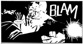 Fig. 1. Marv Fires. Sin City: The Hard Goodbye, Episode 5, 1/6, 1992. |
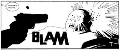 Fig. 2. Marv Fires Again. Sin City: The Hard Goodbye, Episode 5, 1/8, 1992. |
This physicality of the letters is reinforced on the following page. Here, Marv fires again, finally killing his victim outright. (Fig. 2) The panel is framed in a reverse angle looking over Marv’s shoulder, showing the hoodlum as he is shot in the head. All that can be seen of Marv is his hand holding the gun, and both are in silhouette from the flash of the gunshot. The Blam accompanying this second shot, whose A and M overlap in the same fashion as the previous Blam, is also in silhouette. Again, this use of light and shadow is consistent with the representation of the letters hanging in the physical space somewhere between Marv (and, in this instance, the reader as well) and the flash of the gunshot.
Intricate as this early staging of Blam is, it hardly compares with the most conspicuous representation of Blam in The Hard Goodbye—and perhaps in all the Sin City comics. Episode six ends with Marv in a confessional interrogating a venal priest before murdering him with three shots from his gun. The exchange between Marv and the priest is depicted on one page in nine relatively conventional panels of equal size and shape. On the following page, however, the visual grammar is exploded “literally” (and literally) when Marv opens fire. (Fig. 3) Miller depicts three scenes with each shot—the gun going off, the priest falling back as a bullet exits his head, and a low angle of the cross atop the church—each encompassed within the word Blam. This is very striking visually, not least because of its challenge to the narrative conventions of the comic book, and, by extension, to comic book theory itself.
Intricate as this early staging of Blam is, it hardly compares with the most conspicuous representation of Blam in The Hard Goodbye—and perhaps in all the Sin City comics. Episode six ends with Marv in a confessional interrogating a venal priest before murdering him with three shots from his gun. The exchange between Marv and the priest is depicted on one page in nine relatively conventional panels of equal size and shape. On the following page, however, the visual grammar is exploded “literally” (and literally) when Marv opens fire. (Fig. 3) Miller depicts three scenes with each shot—the gun going off, the priest falling back as a bullet exits his head, and a low angle of the cross atop the church—each encompassed within the word Blam. This is very striking visually, not least because of its challenge to the narrative conventions of the comic book, and, by extension, to comic book theory itself.
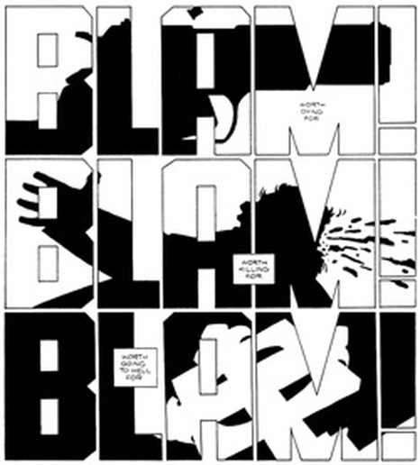
Fig. 3. Marv Kills the Priest. Sin City: The Hard Goodbye, Episode 6, 1-3/8, 1992.
Although his work predates Miller’s, Will Eisner does anticipate some of the effects seen in this example from Sin City in Comics and Sequential Art. Eisner’s discussion of the function of the comic book panel or frame, in particular, helps explain much of what Miller must be trying to achieve. He observes that
[t]he range of possibility of outline is limited only to the requirements of the narrative and the constrictions of the page dimensions. Because the function of the panel outline is in service of the story it is actually created after—or in response to the action determined by the author/artist. (51)
This wide-ranging dictum certainly would include experimentation of the sort seen in The Hard Goodbye, and Eisner does mention what he calls the “sensory” aspects of the panel frame. The frame’s shape “can be used to convey something of the dimension of sound and emotional climate in which the action occurs” and the unusual panel frame can, “[i]n addition to adding a secondary intellectual level to the narrative, … deal with other sensory dimensions.” (46) Sound is indeed one of these possible dimensions; Eisner provides one example of the jagged frame outline, which he notes “conveys a state of tension and is related to the crisp crackle associated with radio or telephonic transmission of sound.” (46) But this is as far as Eisner takes the link between the frame and graphic transcription of sound.
Yet there are a number of elements at work in Miller’s Blams that go beyond Eisner’s analysis. First, there is the interplay between sight and sound: the letters, depicting a sound, frame the graphic representation of the scene, a stark reversal of the usual comic book grammar, which sees the words of dialogue and sound effects contained within the unambiguously visual convention of the panel frame. This places the sound on the level of the picture plane between the scene and the reader, in this way reaching the reader “first”. Eisner does recognize the visual subordination of these planes: “[w]hereas the conventional container-frame keeps the reader at bay—or out of the picture, so to speak” the unconventional frame as used by Eisner in examples similar to this one from Sin City “invites the reader into the action or allows the action to ‘explode’ toward the reader.” (46) But when the specific sound, represented by letters (not simply a jagged line, for instance), makes up the frame in this way, it suggests a reversal of basic physical laws. Here, in short, sound travels faster than light. The effect may not be strikingly evident in The Hard Goodbye’s scene of point-blank gunplay. But this reversal would become more clear if one were to imagine, for example, a scene of a far-off lightning flash framed within panels shaped by the “krakk” of thunder—we all know from common experience that we would see the lightning well before hearing the thunder.
A second, related, point is that the temporal grammar of comics is also being challenged by the arrangement of the letters. As a framing device, each letter (including the exclamation mark) is itself a separate and thus a distinct panel, and multiple panels normally depict the passage of time, however slight, in comics and other forms of sequential art. Yet in this case the separation of the panels violates this visual grammar, as it is relatively clear we are looking at three, not eighteen, distinct moments in time. What accounts for this interpretive leap? In Understanding Comics, Scott McCloud identifies this phenomenon as “closure”: it is that “of observing the parts but perceiving the whole” (63). McCloud argues that this is a hermeneutic skill learned in everyday life: one example is the infantile game of peek-a-boo, in which “gradually we learn that while the sight of mommy comes and goes, mommy remains.” (62) Yet McCloud does not deal with any instances remotely as complex as this example of Blam; when he talks about the “parts,” McCloud takes the panel frame as his basic unit, and the complete narrative is his whole. It is likely that, taken in isolation, a reader might have some difficulty interpreting the Blam panels right away because each Blam on its own does not depict a visual sequence. This need for additional context—knowledge of the narrative and the preceding panels—suggests a manipulation on a fundamental level one grade lower than that of McCloud’s “closure.”
Moreover, this sequence in The Hard Goodbye encourages further reflection, beyond the anything in comics theory, upon the relationship between letters, words, and sounds in the medium. The sound of a gunshot is a single, indivisible and instantaneous unit; its verbal representation, Blam, however, is not. Blam is indeed monosyllabic and denotatively indivisible, but each phoneme of which the word is constructed requires a distinct space of time, no matter how small, in which to be sounded. On the other hand, the act of seeing the word when it is written down on the page, is as instantaneous as seeing the scene in which the sound occurs. Thus the word signifying the sound can either reproduce the temporal or the auditory features of its signified, but never both at once.
In the seventh episode, Miller does not challenge his readers quite so much. Yet here too Blam is represented in a completely different visual mode than in the two instances examined above. The episode features a sequence in which a woman, Wendy, is trying to kill Marv by simultaneously shooting at and running over him. There is much onomatopoeia: the “Skreeee” of the tires, the “whumpp” of Marv rolling off the car’s hood, the “spak spak” of bullets hitting the pavement. The letters of these words overlap borderlessly, turning the words into complex shapes in which the letters become difficult to make out: this is especially true in the final “skreee” as the car drives off. But even in that intricate shape, the letters are contained within an outer border, which does not violate the visual grammar of the comic itself. This is not true of the repeated Blams in the sequence. (Fig. 4) As Wendy rapidly fires at Marv, the letters of the Blams overlap each other, and even merge with the flashes from Wendy’s gun. Yet these sounds are contained by no outline; they overlap into the surrounding panels. Thus the conjoined letters and the “gutter,” the marginal space between the panels, become indistinguishable. The letters of Blam in this case, far from being treated as physical entities within the scene (as in Fig. 1 and 2), or as frames of a scene in their own right (as in Fig. 3), are now delineated by the negative space beyond the narrative frame. In sum, therefore, these three manifestations of Blam from The Hard Goodbye represent the peak of Miller’s lettristic experimentation with onomatopoeia in Sin City.
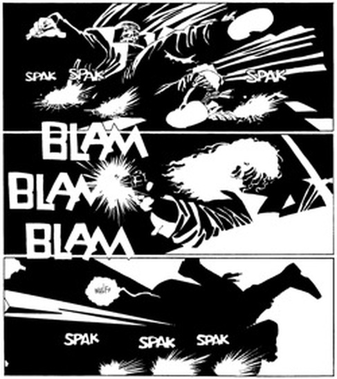
Fig. 4. Wendy Attacks Marv. Sin City: The Hard Goodbye, Episode 7, 1-3/7, 1992.
Curiously, neither Eisner nor McCloud directly address the issue of onomatopoeic words in comics, and surely not to the degree to which The Hard Goodbye raises it. Eisner comes closest to this in his section on “Framing Speech” in Comics and Sequential Art, where he says that “the [speech] balloon is a desperation device. It attempts to capture and make visible an ethereal element: sound.” (26) Eisner sees this as a logical combination of the visual aspect of speech, the warm breath expelled which can sometimes be seen as steam, with the equally visual, lettristic representation of the words spoken; he points out that Italian comics are called fumetti, named for these same speech “clouds.” Eisner provides no such fanciful justification for the use of letters to represent sound effects, although judging by the sparing use of onomatopoeia in his own work, he is not so concerned about this theoretical aspect. In his discussion on the omission of text in comics, Eisner says that “the artist should be free to omit dialogue or narrative that can clearly be demonstrated visually” (132). His example is telling, especially for our purposes: Eisner draws a scene in which a man is being shot. The panel, “as directed by the script,” has a narration at the top reading “Jones is shot from behind”; a drawing of Jones, as he is shot, saying, “Gad! I’ve been shot in the back!”; and the word “Bang!” in a cloud of smoke behind Jones. Here Eisner has implicitly linked the visual adjunct to the gunshot sound, the puff of smoke, with the visual depiction of the sound, the letters forming “Bang.” (132) What is also of interest is that, in Eisner’s demonstration of how to cut redundant text in a graphic medium, the onomatopoeic word is the only one that cannot be omitted without making the scene unintelligible: with the “Bang” missing, Jones could just as easily be having a heart attack, for example.
McCloud, for his part, spends a whole chapter of Understanding Comics—“Show and Tell”—on the interaction of words and pictures in the comic medium. McCloud sees words and pictures, treated throughout much of Western history as a dichotomy between literature and art, respectively, as the two ends of comic books’ continuum of representation. Like two balances on a scale, words and pictures are each employed in greater or lesser proportion depending on the needs of the comic in question. While most combinations McCloud recognizes as “Inter-dependent,” where both words and pictures work together to convey an idea which neither could alone (155), he lists many other categories of word-picture combinations: “word-specific,” “picture-specific,” “duo-specific,” “additive,” “parallel,” and “montage” combinations. (153-54) Yet in none of his examples does McCloud use an onomatopoeic word as an example; he, like Eisner, continues to treat text as a purely visual element in comics, without considering the auditory aspects implied in the letters. Onomatopoeia is taken for granted, its implications left unexplored.
What remains to be seen is whether Miller himself addresses these implications in his subsequent work. His one-shot Sin City tale Silent Night illustrates how the depiction of Blam—both as word and as sound—begins to progress after The Hard Goodbye. This story, published in 1994, is a series of full-page panels: on a snowy night, a suitably hard-boiled man infiltrates the hideout of three criminals, kills them, and rescues the little girl they have been holding prisoner. There is no narration, and only one dialogue balloon. The only “sound” in the comic, Blam once again, comes when the man shoots each of the girl’s captors. (Fig. 5 and 6)
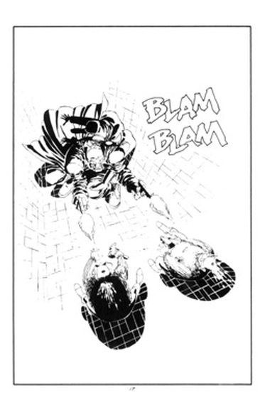 Fig. 5. The Brothers are Killed. Sin City: Silent Night, 17, 1994. |
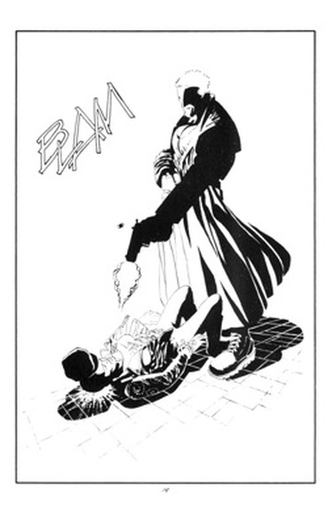 Fig. 6. The Woman is Killed. Sin City: Silent Night, 19, 1994. |
Two features are worth noting: first, while the arrangement of the Blam letters in this case is not as visually complex as in The Hard Goodbye, the letters do have a distinctly visual dimension, separate from their onomatopoeia. The first two Blams are drawn identically, while the letters of the third are markedly different. At first glance, this is odd. There can be no auditory distinction between the letters: they are the same words, depicting the same sounds, gunshots—they are even gunshots from the very same guns. But the victims of the first two gunshots are two stocky men who appear to be brothers, or perhaps twins, while the victim of the third is their visual opposite, the female ringleader; moreover, the letters of the first two Blams appear more rough and masculine, the letters of the last, more lithe and feminine. Thus the sound-word is given added meaning though its purely visual dimension.
The second notable feature of Silent Night is the challenge it represents to onomatopoeia more generally, similar to the challenge presented in The Hard Goodbye. The three gunshots and the brief dialogue mean that, as far as the narrative goes, this is not a truly silent night. But the interplay between the lettristic representation of the words and the sounds which they signify reminds us that this comic, like all comics, is completely silent, a fully visual narrative medium. Even if its textual elements were to be read aloud, unlike a novel or poem, even the most verbose comic book would not be fully intelligible to a listener.
This graphic significance of letter forms generally, and in comic book art specifically, is certainly not lost on Miller, and his awareness of it is demonstrated by his work during this period, both on Sin City and on other, related projects. For example, there is more lettristic parody afoot in The Big Fat Kill, the third Sin City miniseries, from 1994-1995. Miller begins the final issue with a title page in which “The Big Fat Kill” is written in letters reminiscent of Greek capitals. (Fig. 7) This prefaces a page describing the famous Battle of Thermopylae, a subject Miller would depict four years later in his Eisner Award[iii]-winning comic 300. Here, however, there is no immediate clue as to what all this has to do with the sordid tale of urban violence that Miller has been spinning in the four preceding issues. But the large letters of “The Big Fat Kill” are just Greek enough to establish a link whose foreshadowing, presumably, will find its completion later on. Sure enough, right before the climax, Dwight, the tale’s hero, plans to ambush his many enemies in a narrow alleyway, thus negating the advantage of their overwhelming numbers. Miller provides verbal and compositional cues that immediately recall the earlier panel-page about Thermopylae: whereas there Leonidas was drawn in silhouette in the narrow space between two cliffs, rising on either side of the full-page panel, now Dwight is drawn in silhouette in the narrow space between two brick walls which also frame their respective panel-page. Dwight’s narration reveals that, just like Leonidas, he is able to make “a careful choice of where to fight”; (26) thus, the promise of a historical allusion first signalled by the Greek-style lettering is finally fulfilled.
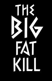 Fig. 7. Title page for The Big Fat Kill. Sin City: The Big Fat Kill #5, 1, 1995. |
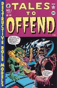 Fig. 8. Cover of Tales to Offend #1, 1997. |
Similarly, with 1997’s Tales to Offend, Miller parodies the EC science fiction and horror comics of the 1950s, such as Weird Science and The Crypt of Terror. Indeed, among Miller’s comic book influences was the work of such EC artists as Johnny Craig and Wallace Wood. (Fuller 15) Tales to Offend was a “one-shot” issue collecting some of Miller’s short comics—including a Sin City tale, “Daddy’s Little Girl”—and so the stories are not drawn in the distinctive EC “house” style, as exemplified by Craig and Wood, but in Miller’s inimitable own. The graphic allusion and parody comes, as before, not through the comic’s pictorial elements, but through the rendering of its letterforms. Miller’s narrative debt to the pulp tradition (as with Sin City) is clear; but the parody is made specific when Miller copies the distinctive letter shapes and layout of the EC comics’ title graphics on his own cover page exactly. (Fig. 8)
By this time, however, Miller’s Sin City stories show a considerable withdrawal from their high point of playfulness and lettristic experimentalism. Ironically, this is clear especially on Sin City’s “letters” page, which prints correspondence from readers, along with editorial responses. The letters page for Sin City is of particular interest not only because it presents precise evidence of the graphic shift in Sin City’s letterforms, but also because Miller himself, as the sole artist and writer of the series, is more intimately involved in the correspondence than are the creators of more mainstream (and more prolific) comic book titles. Miller often writes long, politically charged polemics on the letters page, and the readers’ letters which see print are just as atypically lengthy, articulate, and passionate, whether they are in vociferous support or in virulent opposition to Miller’s positions. In nearly every instance, Miller writes a reply to readers’ letters. Thus, a closer look at a few representative letters pages will not only aid understanding of Miller’s treatment of and attitude toward alphabetic letters, but epistolary ones as well.
It is conventional for the letters pages of a comic book to have a name punning on the comic’s subject matter—the Batman comic’s page was called “Bat-signals,” for instance, while Frank Miller’s own Thermopylae-themed 300 letters page was called “Slings and Arrows.”[iv] Blam, for obvious reasons, was the natural choice for that of Sin City. Moreover, the distinctive Blam frames from The Hard Goodbye had become so associated with Sin City that one was reused as the letters page logo in the relatively early The Big Fat Kill. (Fig. 9) However, while Blam itself would remain the title of the letters page for the remainder of Sin City’s issues throughout the 1990s, the Blam logo of The Hard Goodbye, with all its complexities, did not endure. The letters page Blam of 1997’s Just Another Saturday Night, one of the later Sin City entries, is a much simpler, and less visually challenging, version. (Fig. 10) Significantly, it is not a typewritten, nor a generically comic-book-style Blam: it is indeed an authentic Blam from within a Sin City comic. Though the letterforms themselves are no longer remarkable, their specific arrangement remains typical of Miller’s Sin City depictions: the L slides under the one foot of the A, while the A’s other foot is crossed with that of the M. This is nearly identical to the two “physical” Blams (Fig. 1 and 2) from The Hard Goodbye, as well as a number of other depictions of the word in the Sin City books. Thus, on a superficial level, this Blam is indeed representative of Sin City; but it is also representative of how Miller’s visual treatment of onomatopoeic words evolves into a more conventional style.
 Fig. 9. Letters Page. Sin City: The Big Fat Kill #5, 40, 1995. |
 Fig. 10. Letters Page. Sin City: Just Another Saturday Night, 22, 1998. |
This evolution is clear in Hell and Back: A Sin City Love Story, the final Sin City “yarn,” first published in 1999 and 2000. Miller no longer supplies the creak of a door or the crunch of an extinguished cigarette; and even though a fair amount of gunplay remains, the sound of every last report and ricochet is not necessarily accompanied by the wide range of sound effect words found in earlier tales like The Hard Goodbye. When the ubiquitous Blam does appear, it is visually homogenized. For instance, when the gangster Wallenquist murders a man near the end of Hell and Back, his gun goes Blam, as expected; but the letters of the word are uniformly outlined and overlapping, neatly filling the white space in the panel frame without crossing over into the gutters. (Fig. 11) They appear neither in front of nor behind any of the other elements in the scene, and although they appear directly above the flashing muzzle of Wallenquist’s handgun they are neither lit up nor cast in shadow as a result. Fully contained by, yet divorced from, the physicality of the scene within the panel, they no longer pose a challenge to the grammar of the comic book page. Their function is, in a manner of speaking, purely auditory.
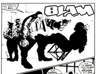 Fig. 11. Wallenquist Fires. Hell and Back: A Sin City Love Story #9, 1/52, 2000. |
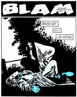 Fig. 12. Wallace Finishes Off Delia. Hell and Back: A Sin City Love Story #8, 1-2/4, 2000. |
There is another striking, yet ultimately less challenging instance of Blam elsewhere in Hell and Back. After another round of gunplay, Wallace, the story’s protagonist, finds Delia, an assassin who is a recurring character in the Sin City tales, mortally wounded. Delia begs Wallace to “have mercy on her” and he promises to do so—with a gunshot which puts her instantly out of her misery. Here the word Blam fills a panel the width of an entire page. (Fig. 12) But what a difference there is between this and the Blam panels in The Hard Goodbye. For one, there is a shift in the visual emphasis of this sequence; as the killing is not done out of malice or vengeance, Miller’s choice not to show Delia’s head practically exploding, as he does elsewhere, certainly befits the tone of the scene. We are given only the letters of Blam with Wallace’s narration inside them. However, here, again, the letters are utterly conventional and homogenized. Aside from the spacing, the word is rendered indistinguishably from its counterpart in the Wallenquist scene. Unlike the complex composition of the Blams in The Hard Goodbye, this Blam is simply placed within a blacked-out panel, and not framing it. Even the distribution of Wallace’s narrating words, one sentence in the B, another in the M, has few structural implications. If we were to read each letter as a separate frame, and thus as a separate moment in time—unlikely, since the letters remain within their own frame— there is no temporal play here because only words, not images, are contained within the letters. In addition, as Eisner points out, the position of speech balloons—and, by inference, speech boxes, as in this example, which enclose an interior monologue—“to each other, or to the action, or their position with respect to the speaker, contribute to the measurement of time.” (26) Thus, the natural pause Miller wants to convey between the two thoughts is achieved by the distance between them, and would be the same if they were the only element within the frame. The closer proximity of Wallace’s thoughts in the following panel, in contrast, means they do need their own separate panels in order to be taken as separate temporal units.
This seeming disinterest in the implications of letterforms is also reinforced on Hell and Back’s letters page. In the ninth and final issue it is taken up almost entirely with one single letter heaping abuse upon Miller, especially with regard to his views on self-censorship in the comics industry. A short excerpt will be sufficient to get the flavour:
… GROW-UP YOU WORM!!! WHY IS IT THAT EVERYTIME YOU DRAW A MAN, HE HAS TO BE NAKED AND HIS GENITALS COMPLETELY EXPOSED?? IS IT BECAUSE YOU THINK YOU CAN GET AWAY WITH IT OR ARE YOU TRYING TO START SOMETHING? OR IS IT BECAUSE YOU LIKE DRAWING THINGS LIKE THAT? GO ON, KEEP IT UP. … (55)
The content of the letter is not important; it deserves no further response than Miller’s icily ironic own: “Thank you for your kind and considerate remarks. Letters like yours make it all worthwhile.” What is of interest, however, is the implicit lettristic attitude of Miller and his editor in printing this malevolent missive. The letter, as the editor writes above it, “is reproduced here exactly as we received it, all in upper case letters, though the original was hand-printed. Spelling, grammar, and punctuation mistakes have been kept intact.” (55) This disclaimer is evidently meant to assure the outraged reader that the usual practice of editing letters for space or spelling has, in this egregious example, not been followed. Yet this seemingly impartial strategy still colours the text’s presentation. Presumably, this is not the only handwritten letter ever received by Blam, and one might naturally doubt whether that feature of the original would merit mentioning if the content were not so inflammatory. Also, printing handwriting in capitals does not necessarily have the same, if any, “crazy” connotation as printed capital typeface.[v] Those involved in the writing and publishing of comic books, moreover, should—of all people—realize this.
Indeed, Will Eisner addresses this very point. In Comics and Sequential Art, he notes that
[a]ttempts to ‘provide dignity’ to the comic strip are often tried by utilizing set-type instead of the less rigid hand lettering. Typesetting does have a kind of inherent authority but it has a ‘mechanical’ effect that intrudes on the personality of free-hand art. Its use must be carefully considered because of its effect on the ‘message’ as well. (27)
Eisner goes on to provide a graphic example of this, leaving the reader to come to his own conclusions. Here, in fact, we may present an even more compelling example—a quotation from Scott McCloud given earlier in this essay: “gradually, we all learn that while the sight of mommy comes and goes, mommy remains.” (62) As a meta-comic, Understanding Comics follows the conventions of the comic book in its treatment of letters in this sentence as with every other. But were this text quoted “exactly” as the angry letter to the Blam letters page, “all in upper case letters, though the original was hand-printed,” it would have to be rendered thus: “gradually, we all learn that while the sight of mommy comes and goes, mommy remains.” (62) What is accepted lettristic practice in one context—and hence goes almost unnoticed—is foreign, utterly jarring, in another.
This conventional attitude toward hand-lettered versus typeset text is not absolute; for instance, MAD magazine regularly uses typeset text within speech balloons. But in that case, typeset letters, not handwritten ones, have become the convention, and thus lose any marker of novelty or oddity with respect to other sections of text. In most comics, including the Sin City series itself, hand-printed capitals remain by far the most common letterforms. This is further reinforced by the fact that, in recent years, computer-generated letters have become common in comic books only when they are in fonts made to look just like hand-printed capitals.[vi]
One last proof that Miller’s attitude towards the graphic letterforms in Sin City, and their implications, is inconsistent comes from the circumstances surrounding the adaptation of his Sin City stories into a 2005 film. For years, Miller was notoriously resistant to the idea of making Sin City into a movie, having had bad experiences with Hollywood; Miller would even assert this on Sin City’s letters page. One reader wrote in to Blam in the mid-1990s,
I keep hearing rumors about a Sin City movie. I hope they are unfounded. Movies always suck the soul out of comic books, and I don’t want to lose Sin City to Hollywood vultures. I know you’re a genius and if anyone can make a great Sin City movie, it is you; but why risk it? Why throw this fabulous creation to the dogs? (Just Another Saturday Night 18)
To which Miller replied: “Worry not: there ain’t no stinking Sin City movie in the works.” (18) It took a test sequence, filmed by director Robert Rodriguez to look as photographically close as possible to the original comics, to convince Miller to allow a filmic adaptation of Sin City. (Fuller 12) Rodriguez, in Sin City (2005), which adapted The Hard Goodbye and The Big Fat Kill, among other stories, strove to create a “scrupulously meticulous translation.” Rodriguez lit and framed his film’s shots to look so much like Miller’s illustrations that Rodriguez insisted that Miller receive directorial credit, giving up his own membership in the Director’s Guild of America in order to do so. (14) Significantly, Miller seemed to see his work in more cinematic than literary terms: the almost pathological attention to the composition of the film’s visuals was, evidently, what constituted a “faithful” adaptation. The lettristic play of the Blam letterforms, however, was not retained, even though the action was shot against a greenscreen, with most of the sets and effects computer-generated (Olsen 16). In other words, there was no technical impediment to adding, for instance, the word Blam as a physical element in a particular scene, as it was (Fig. 1 and 2) in The Hard Goodbye.
Perhaps it would be too much to expect that the intricate play between the visual and the onomatopoeic of the early Sin City comics remain in the later sequels. Sin City, itself a parody—Scott McCloud would describe it in Reinventing Comics as “a tongue-in-cheek, over-the-top hyper-noir genre send-up” (81)—had already become emblematic of a very limited genre of comics storytelling by the mid-1990s. McCloud relates an experience he had as a guest on National Public Radio’s Talk of the Nation in May 1995: as an example of contemporary comic book writing, Talk of the Nation’s host, Ray Suarez, read dialogue from Sin City. After McCloud presents a sample or two (“Hardware like she’s got and Lucille’s a dyke, it’s a damn crime!”), he depicts himself hanging his head, thinking “Oh great. They had to pick this…” (81) McCloud rightly notes that the “more ironic aspects were utterly lost in the translation,” (81) but at the same time, we have seen that Sin City had already begun to lose its experimental edge (at least with respect to its writing, in both the pictorial and literary senses). Indeed, in The Aesthetics of Comics, David Carrier critiques the critical stance regarding innovation which McCloud takes in Understanding Comics. McCloud asserts that there can be no sequence of panels in which the constituent panels are not related to one another: “a relationship of some sort will inevitably develop” (73) simply by virtue of the panels being placed together. This would imply a broad scope for narrative innovation, with which Carrier takes issue:
Occasionally a comic may use such juxtapositions, but in practice no narrative could develop unless most transitions were relatively straightforward … Comics[vii] are like realist novels: a few odd transitions are possible only because we are accustomed to reading the body of the text as straightforward narrative.” (51-52)
Were we to apply this principle to Sin City, we could only conclude that panels such as the Blam panels in The Hard Goodbye (Fig. 3), for example, could not by their very nature be repeated without sacrificing narrative cohesion, to say nothing of their originality.
Whether that lettristic play proved too difficult to sustain, or whether Miller simply lost interest in that aspect of his work remains open to interpretation. It is certainly true that the varied and complex Blams of The Hard Goodbye had all but disappeared by the time of Hell and Back. But, as Miller’s approach to lettristic visual elements in the intervening years illustrates—the visual marking of the Silent Night Blams, the letterform parody of The Big Fat Kill and Tales to Offend—his early experimentalism could not have been a mere haphazard accident. What is more likely is that despite an instinctive understanding of the graphic potential of onomatopoeic letterforms, this play was never Miller’s primary concern. The disinterest with respect to the letterforms (and the forms of readers’ letters) of the Blam letters page points toward this; so too does the same disinterest regarding the Sin City film, considering the attention given in it to other visual features. Nor could Miller be blamed for this inattention to such an artistically fruitful aspect of his medium, as, judging by the work of Eisner and McCloud, comics writer/artists of the time, and likely even now, did not consider the implications inherent in the visual representation of onomatopoeic letters even if they, like Miller, shared an implicit understanding of how they functioned within the comics medium. Whatever the answer, it is clear that the literal architecture of Sin City ends, experimentally speaking, not with the Blam of old, but with the graphic equivalent of a whimper.
Works Cited
Carrier, David. The Aesthetics of Comics. University Park: Pennsylvania State University Press, 2000.
Eco, Umberto. “The Myth of Superman.” Heer and Worcester 146-164.
Eisner, Will. Comics & Sequential Art. Tamarac, FL: Poorhouse Press, 2005.
Fuller, Graham. “Colour Me Noir.” Sight and Sound 15.6 (2005): 12-16.
Heer, Jeet, and Kent Worcester, eds. Arguing Comics: Literary Masters on a Popular Medium. Jackson: University Press of Mississippi, 2004.
Mann, Thomas. “Introduction to Frans Masereel, Passionate Journey: A Novel Told in 165 Woodcuts.” Heer and Worcester 13-21.
McCloud, Scott. Reinventing Comics. 1st Perennial ed. New York: HarperCollins, 2000.
———. Understanding Comics. 1st HarperPerennial ed. New York, NY: HarperPerennial, 1994.
McLuhan, Marshall. “Comics: Mad Vestibule to TV.” Heer and Worcester 107-111.
Miller, Frank. Frank Miller’s Sin City: The Hard Goodbye. 2nd ed. Milwaukie, OR: Dark Horse Comics, 2005.
———.Hell and Back: A Sin City Love Story. No. 1-9. Milwaukie, OR: Dark Horse Comics, July 1999-Apr. 2000.
———. Sin City: The Big Fat Kill. No. 1-5. Milwaukie, OR: Dark Horse Comics, Nov. 1994-Mar. 1995.
———. Sin City: Just Another Saturday Night. Milwaukie, OR: Dark Horse Comics, 1998.
———. Sin City: Silent Night. Milwaukie, OR: Dark Horse Comics, 1994.
———. Tales to Offend. Milwaukie, OR: Dark Horse Comics, 1997.
Olsen, Mark. “I’m All Those Guys.” Sight and Sound 15.6 (2005): 16.
Parker, Dorothy. “A Mash Note to Crockett Johnson.” Heer and Worcester 35-36.
List of Figures
Fig. 1. Marv Fires. Sin City: The Hard Goodbye, Episode 5, 1/6, 1992.
Fig. 2. Marv Fires Again. Sin City: The Hard Goodbye, Episode 5, 1/8, 1992.
Fig. 3. Marv Kills the Priest. Sin City: The Hard Goodbye, Episode 6, 1-3/8, 1992.
Fig. 4. Wendy Attacks Marv. Sin City: The Hard Goodbye, Episode 7, 1-3/7, 1992.
Fig. 5. The Brothers are Killed. Sin City: Silent Night, 17, 1994.
Fig. 6. The Woman is Killed. Sin City: Silent Night, 19, 1994.
Fig. 7. Title page for The Big Fat Kill. Sin City: The Big Fat Kill #5, 1, 1995.
Fig. 8. Cover of Tales to Offend #1, 1997.
Fig. 9. Letters Page. Sin City: The Big Fat Kill #5, 40, 1995.
Fig. 10. Letters Page. Sin City: Just Another Saturday Night, 22, 1998.
Fig. 11. Wallenquist Fires. Hell and Back: A Sin City Love Story #9, 1/52, 2000.
Fig. 12. Wallace Finishes Off Delia. Hell and Back: A Sin City Love Story #8, 1-2/4, 2000.
[i] Of course, the history of “sequential art”—comic books being the most common modern form of this—can be traced back through such artefacts as the Bayeux Tapestry, Trajan’s Column, and Mayan and Egyptian friezes (vid. McCloud, Understanding Comics, 11-20).
[ii] At least in American English; “bang” used to be more common in comics, but has since been supplanted, perhaps because it sounds closer to the deeper, more stylized tones of gunshots in films of the last few decades. This is purely speculative—but a mere “bang” doesn’t seem to do justice to the sound of, say, “Dirty” Harry Callahan’s .44 Magnum.
[iii] Named in honour of the same Will Eisner discussed throughout.
[iv] Since the 1990s, a number of mainstream “letters pages” have been discontinued in favour of forums set up on the websites of comics publishers. There have been exceptions: Astro City, for instance, bucked this trend in the early 2000s, going so far as to give over a significant portion of its letters page to a debate about the merits of letters pages versus online forums.
[v] It should be noted that the author of this essay routinely prints in capitals, and would rather not have his personality or credibility judged solely on the basis of that fact.
[vi] McCloud’s work again provides a cogent example: Understanding Comics, from 1993, is hand-lettered; Reinventing Comics, from 2000, features a computer font which nevertheless looks hand-lettered.
[vii] Presumably, Carrier means “realist” comic books, which would share the same narrative and mimetic goals. Just as a novel need not be realist, a comic book need not have a “straightforward narrative.”
| arnott_blam_ijoca.pdf |
